Email Design
Graphwell monthly update
A product newsletter for an analytics app. One lead story, three short features and a dashboard screenshot that stays readable on a phone.
Start from this designOpens the project form with this design noted.
- From
- Graphwell
- Subject line
- What shipped in November: dashboards that explain themselves
- Preview text
- Written summaries on every chart, scheduled reports and Slack alerts.
- Industry
- SaaS
Graphwell · What shipped in November: dashboards that explain themselves
What’s in it
- 01Dark hero with product screenshot
- 02Numbered feature list
- 03Two cards that stack on phones
- 04Outlook-safe button
How it stays email-safe
- Table layout, 600px wide, with Outlook ghost tables
- Inline styles, with media queries only as an extra
- Buttons with VML fallbacks for Outlook on Windows
- Images with width, height and alt text
- No scripts, forms or embedded video
One of many directions in Email Design: exploring what’s possible when email meets creativity.
More like this
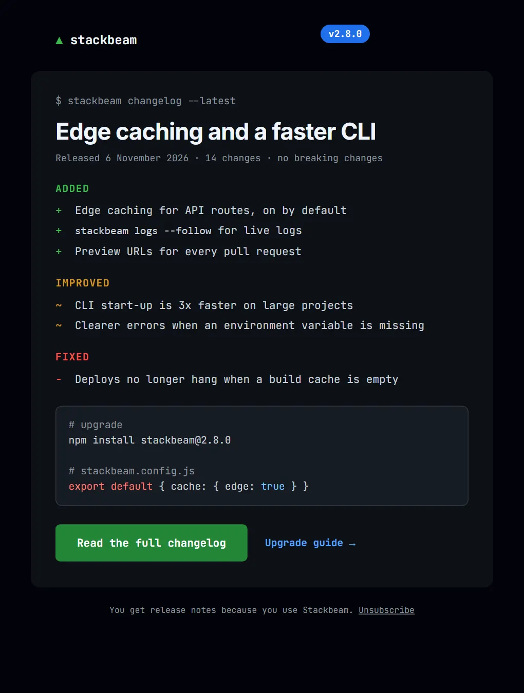
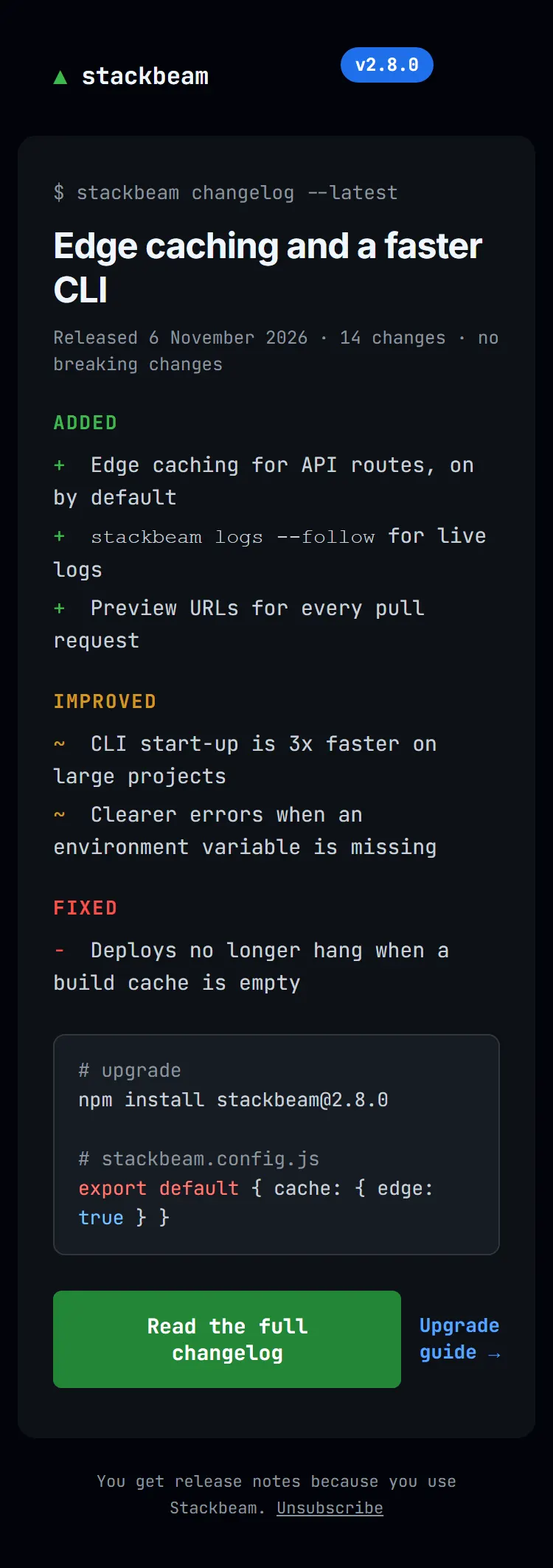
Back to Email Design- Stackbeam · v2.8.0: edge caching and a faster CLI
 SaaS and technology
Stackbeam developer changelog
A release note for developers: terminal styling, Added, Improved and Fixed sections, and an upgrade snippet.
- Dark mode
- Typographic
- Interface-inspired
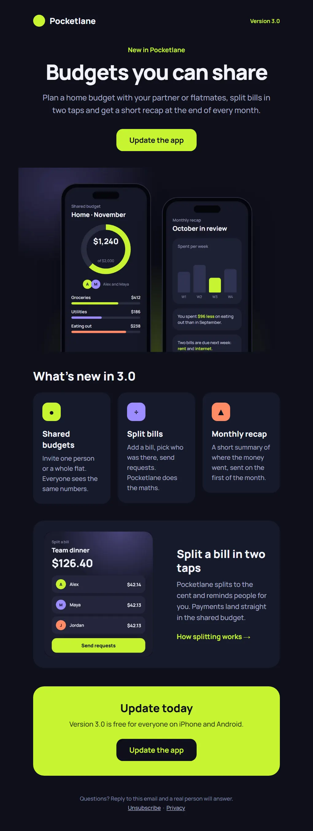
- Pocketlane · Pocketlane 3.0: budgets you can share
 SaaS and technology
Pocketlane 3.0 launch
A dark launch email for a budgeting app, built around two phone screens and a single action: update the app.
- Dark mode
- Interface-inspired
- Bold colour
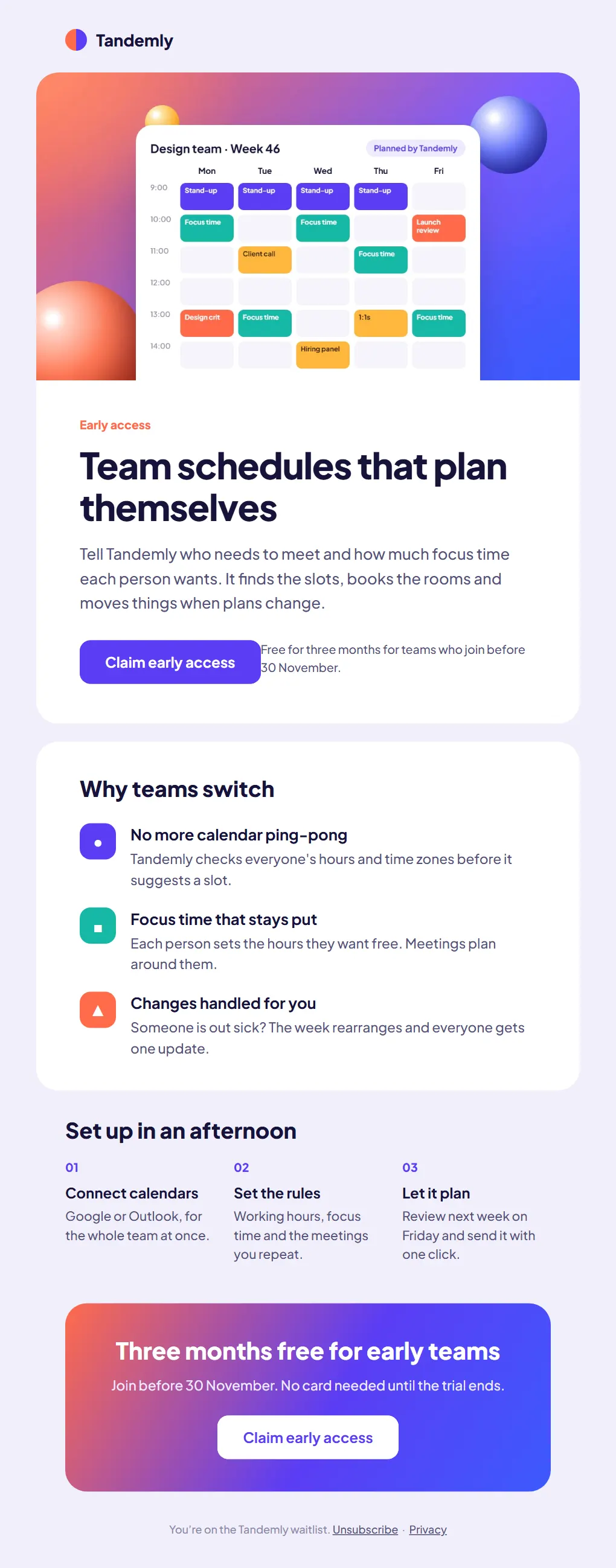
- Tandemly · Early access is open: team schedules that plan themselves
 SaaS and technology
Tandemly early access
A waitlist email for a scheduling startup: a calendar hero, three reasons to switch and an offer with a clear end date.
- Bold colour
- Interface-inspired